Improving multiple live products
At SmartAsset I’m responsible for identifying and improving existing experiences across all different areas for all teams. This requires me to quickly understand the context and collaborate with stakeholders across different teams to create options to test and implement.
Financial Advisor Lead Team
Improving copy for the financial advisor questionnaire handoff screen
The concierge team raised the issue that when reaching out to people who had filled out the questionnaire, many did not expect to be called. We hypothesized that the lack of clarity on the handoff screen did not clearly communicate what would happen next leading to a lower contact rate. I worked with Laura (Product Manager) and Kyrsten (Senior UX Researcher) to improve the copy (lower tech lift) in order to increase the contact rate. After three rounds of user testing, we landed on an iteration that improved the valid contact rate by over 3%.
Financial Advisor Lead Team
Redesigning the financial advisor questionnaire handoff screen
With the success of the copy updates, we moved on to improve the overall design of the handoff screen by addressing problems the product and concierge team had identified.- Users did not see the advisors they were matched with when viewing the site on their phone. This was a result of the advisor matches being placed below the fold and users not scrolling down.
- Users were not prepared to discuss next steps when the customer service team called them.
- Users were confused when receiving a call from a NYC phone number (where SmartAsset is based) and also thought we were their financial advisor match. We call to verify their information and answer any questions they have about the process.
- The advisor matches (on mobile) were difficult to compare as they stretched out over more than one scroll.

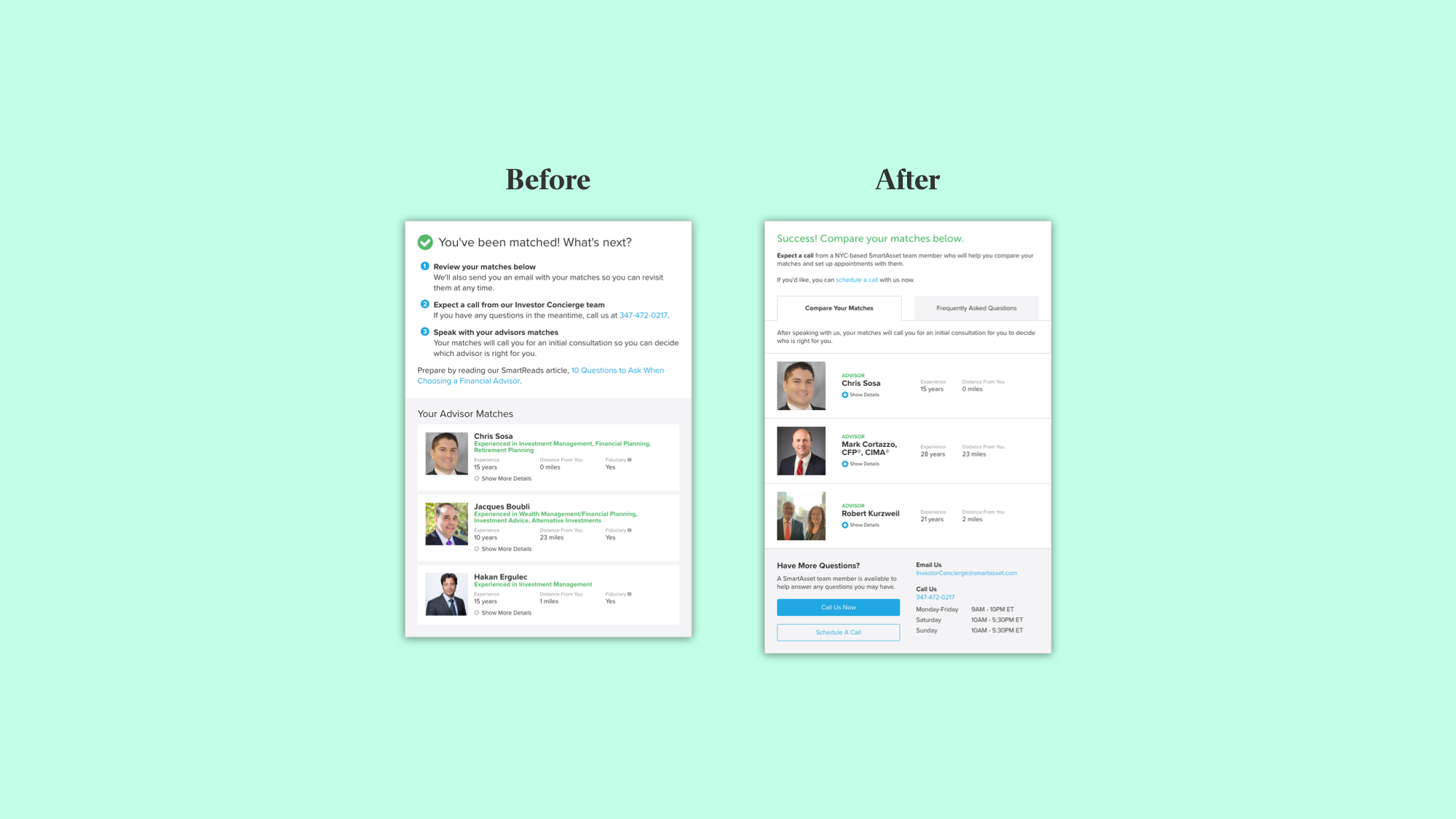
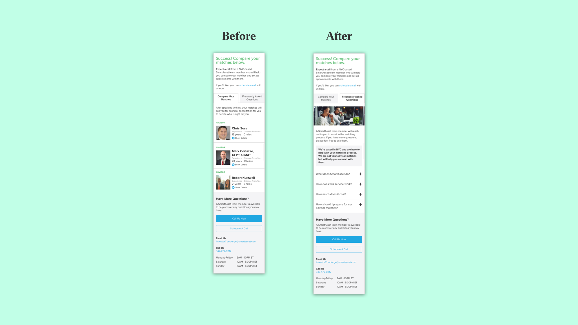
The results of the A/B test showed that the original design outperformed the new design by 0.74%. As this was a negligible difference, the product team decided to remain with the new design because was easier to update and gave more room for testing and optimization. We were unable to measure the success of the FAQ since we don’t have a way to track how “prepared” our users are but hope to have a system in the future that allows us to track it.
Financial ProductsTeam
Creating a comparative monetization unit
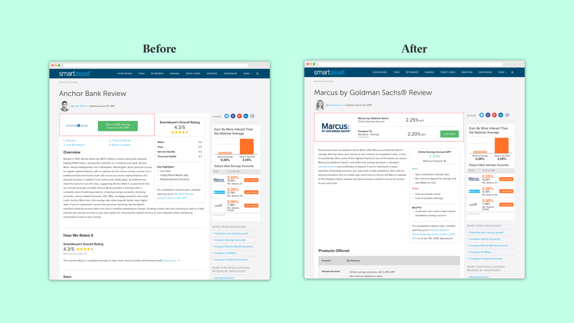
SmartAsset has created reviews for numerous financial products and institutions - banks, mortgage rates, savings accounts, cd accounts, etc. A part of our monetization strategy for these pages is to have partnerships with the institutions that we review and insert a link that goes to their product. But since we didn’t have a partnership with most institutions we’ve reviewed, we originally had placed a link to go to an institution that we did have a partnership with. This was a poor, deceptive, user experience that I raised a flag with and took action to improve. After working with Kyrsten (Senior UX Researcher) to confirm this was a problem, I created a monetization unit that allowed us to insert a different company’s product link while making it clear to the user where they were going to. After launching, we saw success in three areas.
- We increased the number of partner offers we could swap in from one to six due to the flexibility of the new design.
- Revenue increased by over 300% as a result of the increased partner offers.
- In user testing, participants found the new unit clear and helpful.
Editorial Team
Improving search functionality
The SmartAsset Editorial Team produces the content that supports SmartAsset’s blog, reviews and much more. To do so, they use a mix of custom-built tools and off the shelf software which leads to a complicated process. An ongoing initiative has been to slowly consolidate these systems into one place so it’s easier and more efficient. For this project, I worked with Gabe (Product Manager), Chris (Writer/Editor) and Emily (Front-End Developer) to understand editorial’s workflow as well as the technical and product limitations of the search page for the database. I focused primarily on making sure the user experience aligned to the editorial team’s expectations and less on cleaning up the visuals as that was out of scope for the project. 