Mortgage Calculator
I worked with Brian (Product Manager) to redesign SmartAsset’s mortgage calculator with the end goal of improving its position on Google’s search results. Even though the page received a sufficient amount of traffic and had the highest number of backlinks, it had poor user engagement metrics which indicated that the experience wasn’t what users were looking for. As a result of the changes we made, the mortgage calculator jumped from 19th to 4th in Google’s search results.
Identifying the Problems
I started the process by working with Kyrsten (Senior UX Researcher) to uncover problems with the page as well as conduct a competitive analysis of our top competitors. We used a combination of Google Surveys, Google Analytics and Usertesting.com.What We Uncovered
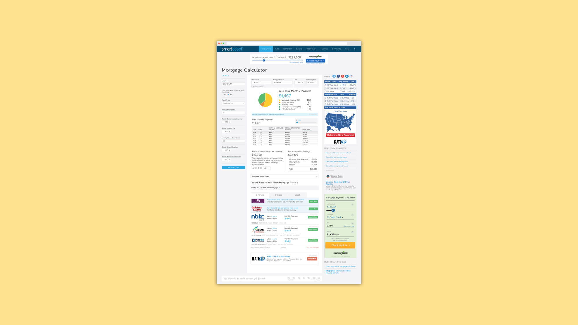
- Users focused on the inputs in the middle and missed the inputs on the left hand side at first glance
- Most users coming to the page were first-time homebuyers that knew their down payment, not the mortgage amount.
- Users found the Recommended Savings and Recommended Minimum Income sections to be helpful and a unique strength of SmartAsset’s calculator.
- The amount of information being presented all at once overwhelmed the users.
- Users found it tedious to scroll up and down to view the accompanying visuals and adjust inputs, especially on mobile.
Mobile First
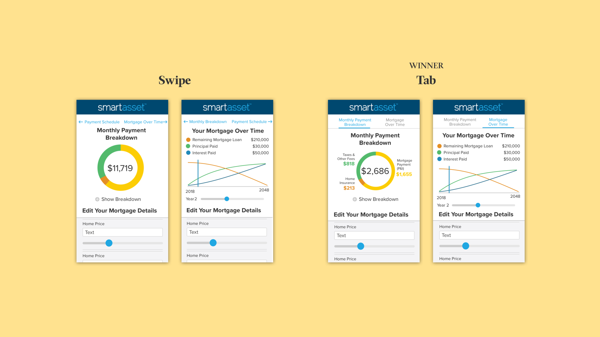
I adopted a mobile-first approach as mobile traffic was increasingly a large percentage of our traffic and it would force prioritization of information amongst stakeholders. After writing a storyframe and reviewing it with Brian, I started exploring different interactions on mobile. One key objective I kept in mind was to figure out a way to present the main content in one screen so that the user didn’t have to excessively scroll up and down.Swipe vs Tab
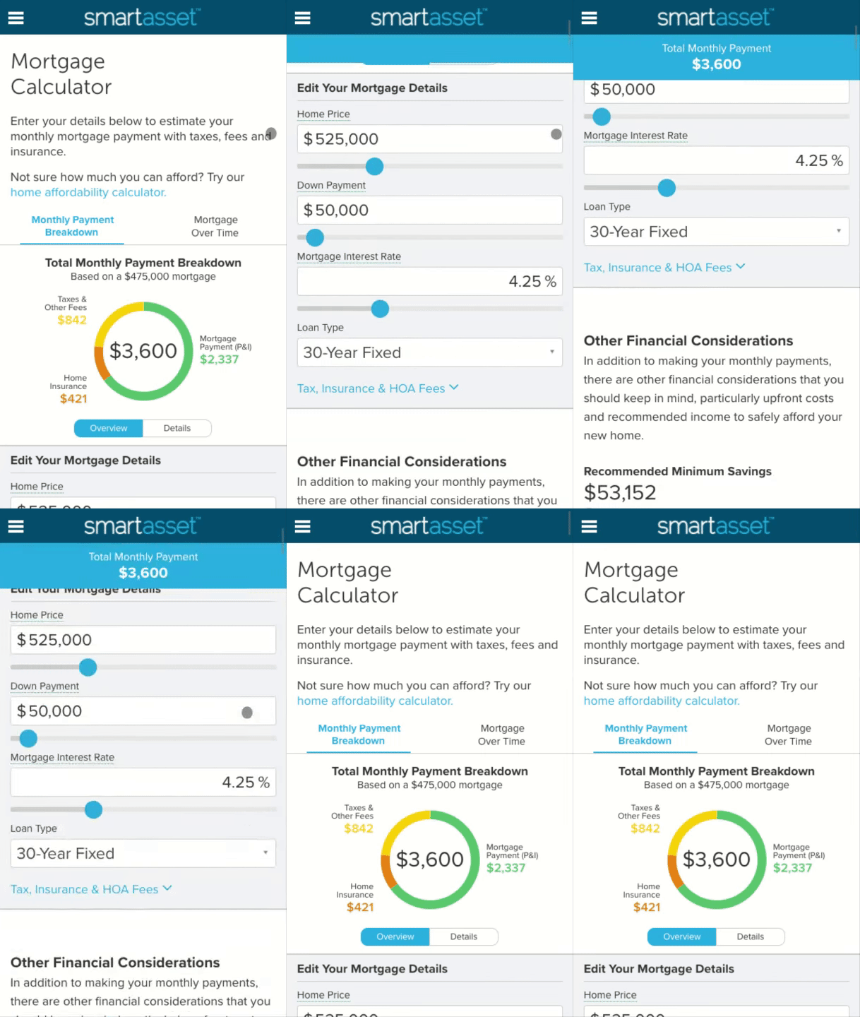
I wanted to consolidate the Mortgage Payment Breakdown and Mortgage Overtime into one viewable screen so I tested swiping versus a tabbed experience. The results of our user testing showed that the tabbed experience was simpler and more intuitive
Accordion vs Tab
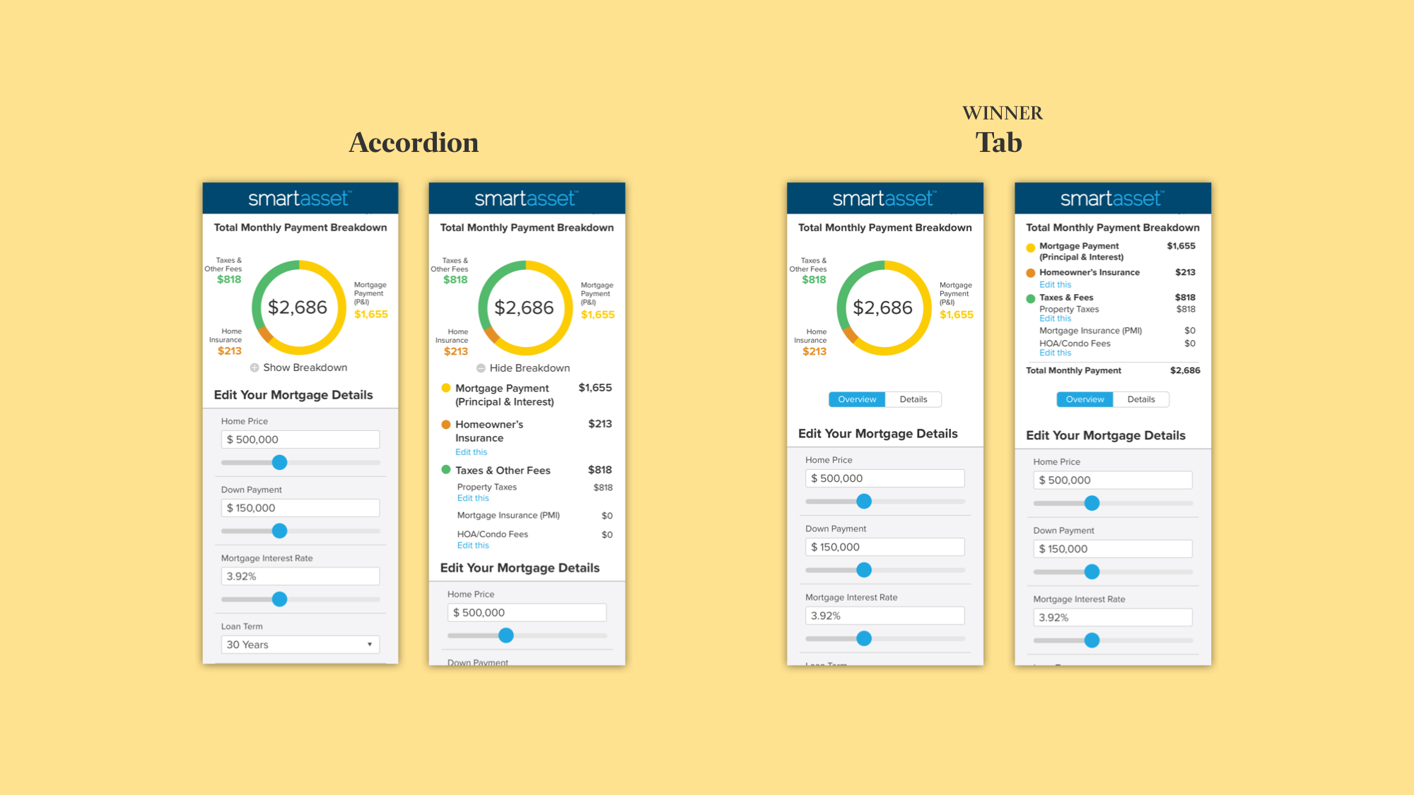
The Total Monthly Payment Breakdown consists of a donut chart with high level numbers and a more detailed breakdown. I explored having the breakdown in an accordion as well as a tabbed experience. I went with the tabs so the user wouldn’t have to scroll.
Sticky Input vs Sticky Answer
I came across the New York Times’ Mortgage Calculator in our research and decided to explore a similar pattern of having a persistent “sticky” answer/output. I created two iterations to test - one iteration had a fixed input and the other had a fixed answer bar. Both directions were aimed at solving the annoying experience of scrolling up and down to adjust inputs to then see the updated answer. We decided to go with the sticky answer option as the inputs took up too much space on the screen.
Making Design Fixes and Improvements
Further utilizing the research we had collected, I then set to redesigning the desktop experience to address the user experience issues Kyrsten and I had uncovered. I switched between designing for desktop and mobile to ensure that the design components would translate well between the two. And of course, we tested many times to land on our final iteration.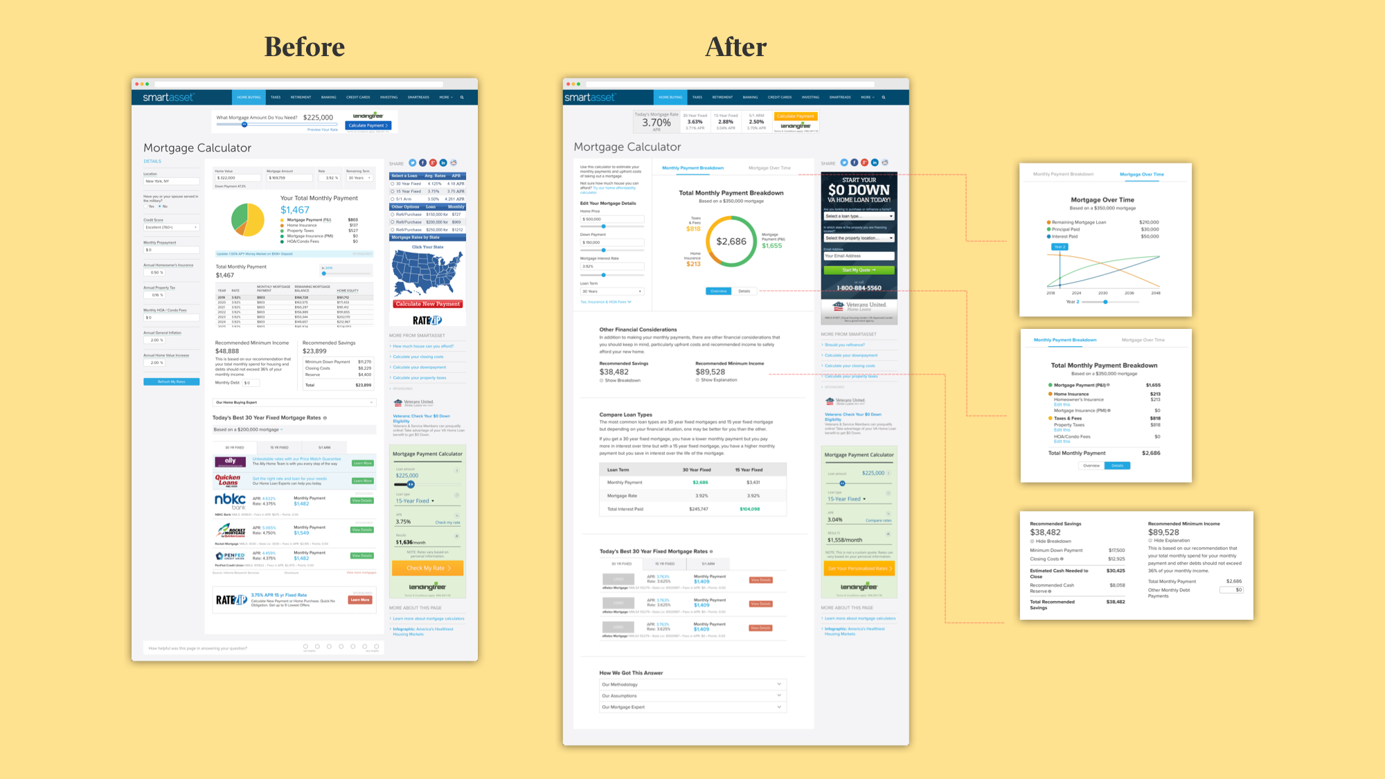
Summary of Changes
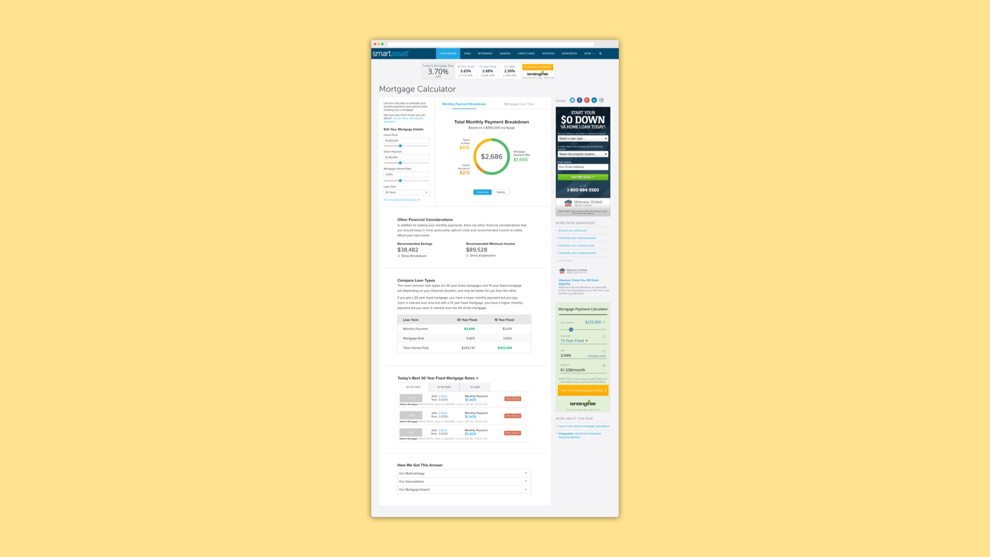
- Restructured the page template so that all inputs were grouped together on the left hand side. (I went through a lot of iterations here.)
- Added an introductory line that eases users into the experience and gives context.
- Changed the input title from “Details” to “Edit Your Mortgage Details” to be more informative and instructive.
- Collapsed the inputs that weren’t frequently used and had a smaller impact on the calculation. Also, instead of titling it “Advanced” or “More”, I named it “Tax, Insurance & HOA Fees” so that users could quickly understand what was in the accordion.
- Changed the pie chart into a donut chart to utilize the space more efficiently on mobile which then carried over to desktop.
- Grouped the Recommended Savings and Recommended Minimum Income into an “Other Financial Considerations” section with new copy so that the experience felt more conversational and helpful
- Utilized progressive disclosure by collapsing the breakdown of the Recommend Savings and Recommended Minimum Income into an accordion so users were not overwhelmed with information.
- Added a “Compare Loan Types” section that educates users on the difference between 30 year and 15 year fixed mortgages. Inspired by Nerdwallet
- Added a “How We Got this Answer” section to provide a basic explanation of how we do our calculations.
- Added ample white space in between sections so the experience wasn’t overwhelming.
Success!
We launched the redesign and saw an improvement across the board in our usability metrics as well as an increase in our SERP position.- Average session duration increased 26.1% overall, with a 31.4% increase on mobile.
- Engagements per user increased 53.7% overall, with a 78.7% on mobile.
- SERP position jumped from 19th to 4th, getting us onto the first page of search results.